What Are the Different Parts of a Logo?
A logo at first glance may seem deceptively simple, but there are many parts of a logo to consider during the design process. In today’s competitive business landscape, a well-designed logo serves as a visual representation of a company’s identity and values. At Riverworks, we understand the significance of logos in brand recognition and aim to create impactful logos that resonate with businesses and their target audiences.
Logos are meant to be a beacon signaling what your business offers to the world. While your logo should be unique and striking, it must also be memorable and straightforward to clearly communicate your brand’s intent. There are several ways to achieve this balance, and understanding the anatomy of a logo is the first step to designing a well-suited and memorable logo for your business. Let’s explore the various elements of logos and how they work together to create beautiful and timeless icons for brands.
Five Fundamental Logo Types
While the realm of logo design encompasses a diverse range of styles, there are five overarching categories that most logos fall into. We’ll review the five fundamental types of logos and outline which ones work best for different industries and brands.
1. Wordmark
Wordmarks are the most straightforward type of logo and showcase a company’s name in text. Using a wordmark as your logo provides a minimalist approach and prominently features your company’s name in a distinctive font, usually custom-created. This type of logo emphasizes the brand’s name and ensures instant recognition.Some of the most well-known companies in the world use wordmarks for their logos because their simplicity exudes confidence and establishes their brand as a household name. Don’t assume a start-up has nothing to gain from a wordmark logo, though; new companies may choose a wordmark to promote their brand and help gain recognition.
While wordmarks may seem fairly uncomplicated, they often present more creative design choices. Colors, fonts, and clever visuals within a company name on a wordmark can help make a logo that stands out while remaining unpretentious. A clear example of this is the FedEx logo. Vibrant purple and orange colors, a bold typeface, and the ingenious hidden arrow make this wordmark iconic. (source – zenbusiness)

Our design team produced a wordmark logo for Flockanooga, a yard flocking company based in Chattanooga, Tennessee. We utilized an iconic flamingo pink with a whimsical cursive font to help their logo make a memorable impression, just like their yard flocking services.
2. Lettermark
 Lettermarks are very similar to the wordmark, yet even more simplified. Lettermarks use a company’s initials, making them suitable for companies with longer names that would not fit in a traditional wordmark logo. By shortening your company name to a monogram your audience is more likely to remember your logo and associate it with your brand.Similarly to wordmarks, lettermarks can be customized to be more distinct and achieve immediate recognition. Think of the Home Box Office (HBO) logo – simple yet impactful with chunky, bold lettering and the famous circle within the “O” to portray a camera lens. (source – logomyway)
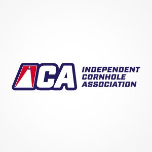
Our Riverworks team designed this lettermark for the Independent Cornhole Association to capture the spirit of their beloved sport. To make the monogram more personalized and recognizable, we incorporated a cornhole board into the letter “I” and angled it to perfectly emulate their sport.
3. Symbol
Symbol logos, or brandmarks, allow you to showcase your company or brand in a stylized, personal way without any text. Symbol logos are best when the icon used can be immediately associated with your brand name in a way that makes sense to the viewer. A perfect example would be the Target logo; a simple, red bullseye to depict exactly what it intends – a target. (source – logo.com)Symbol logos are a very smart option when used in the right context due to the human brain’s ability to absorb visual information faster than text. However, a symbol logo should only be used if the image can be quickly and correctly identified by your audience. There are plenty of ways to get creative with a symbol logo, and a professional designer can help assess if a symbol is a suitable logo for your brand.
4. Combination
A combination mark combines a wordmark and a symbol to create a visual and textual icon for your brand’s identity. You get the best of both worlds with a combination mark, and these types of logos can be very beneficial for new companies. The visuals create allure and draw the eye while the text displays your company name, helping the audience associate the symbol and text with your brand without confusion.These types of logos balance the mysterious allure of the symbol logo and the confidence of the wordmark. Additionally, combination marks can be separated if enough recognition is gained for the symbol to stand alone. The Spotify logo, for example, is a combination mark. Their company name is evident in the logo in bright green next to a green circle with three lines symbolizing sound waves. (source – fabrik)


For Perkiomen Animal Hospital, our design team chose a combination mark. Their logo includes their company name for easy recognition and a unique heart symbol featuring a dog, a cat, and a hand to show the level of care Perkiomen provides to their furry patients.
5. Emblems
An emblem can be thought of as the combination mark’s cousin. Emblem logos involve a symbol and text, but the text is incorporated into the symbol. A prominent example of an emblem logo would be the Harley Davidson logo. The orange and white text is incorporated into the bar and shield symbol to produce a concise, confident, and tough visual. (source – logomyway)Emblem has been used by prestigious and well-known institutions throughout logo history, including universities, government entities, and sports teams. They are a modern take on the historically significant crest or seal, and using an emblem for your logo can lend your brand a sense of legitimacy and legacy.
Colors
While discussing the emotions colors can evoke may seem arbitrary, the truth is that the colors used in the parts of a logo will have a direct impact on how your audience perceives your brand identity. The effects of color on mood and perception have been studied extensively, and it is evident that certain colors can be utilized to achieve the desired effect. For example, red is often associated with passion or excitement while blue is associated with wisdom and peace. (source – verywell)

At Riverworks, we use various colors in logo designs to evoke certain conceptions or themes that suit your brand’s intent. Our design team can use colors within your logo to help bolster the messaging you hope to associate with your company. We also provide hex colors for web use of your logo and CMYK colors for print use, ensuring consistency across digital and physical platforms.
Consider this logo we designed for MJ Motorsports. The red and black in the logo create a stark contrast and quickly portrays a sense of adventure and excitement, something that MJ Motorsports certainly provides with their ATVs and UTVs.
Fonts
Typography contributes significantly to a logo’s personality and message. It’s critical to choose a font that suits your brand’s themes in parts of a logo; a medical professional will not want to use a whimsical script font, for example. The design team at Riverworks Marketing Group can help find a font best suited for your company. Some of the most commonly used fonts are:
- Sans Serif Fonts: Modern and straightforward, sans serif fonts convey a sense of innovation and simplicity.
- Serif Fonts: Reliable and respectable, serif fonts evoke a classic and traditional feel.
- Script Fonts: Infuse creativity and emotions with script fonts, ideal for brands seeking a personalized touch.
Logo Versions
Other parts of a logo to consider are logo versions. It is important to have multiple versions of your logo for various purposes. Different colors and versions are useful in different scenarios. Online use and black-and-white printing cannot accommodate the same logo version, for example, and you’ll want to be sure your logo can be applied anywhere it needs to be for marketing opportunities.
At Riverworks Marketing, we provide:
Full-Color Versions: Perfect for online use and full-color printing, these versions bring your logo to life with vibrant hues.
Single Color Versions: Tailored for black-and-white printing or placement on busy backgrounds, these versions maintain clarity and contrast.
Secondary Logo Marks: In certain cases, we provide additional logo marks, such as icons, which can enhance collateral like business cards and apparel.
File Types: We understand the importance of versatility in logo usage. Our diverse range of logo file types accommodates various needs, from digital platforms to print materials. These include:
- .PNG – The PNG file format is widely used on websites to display high-quality digital images. The PNG files we provide you with have transparent backgrounds making them great for layering on top of colored backgrounds.
- .JPG – JPG is a widely used compressed image format for containing digital images. They are often smaller than PNG files in file size due to their compression process. JPG files do not support transparent backgrounds.
- .EPS – EPS is a vector file format often required for professional and high-quality image printing. EPS files are scalable vector files that can be opened by various platforms which is why we include these in addition to the Adobe Illustrator files.
- .PDF – PDFs are accessible and versatile because they can be opened and read by anyone, regardless of what software they have installed on their computers. The PDF files we provide you are high-resolution and print-ready.
- .AI – AI, or Adobe Illustrator, files are the source files. These files contain high-resolution vector versions of your logos. We provide these files since they are editable, and oftentimes this is the file type print shops will request.
Branding Vs. Logo
A perfect logo is a pivotal element of your brand identity, but it is only a starting point. The parts of a logo should be thought of as a tool in your branding toolbelt, designed to work seamlessly alongside your other branding tools and enhance your company image. Outside of a logo, you should also consider your brand voice, image and photography style, patterns, icons, website design, and more to ensure an impactful branding strategy.
Honing all of these elements takes time, but Riverworks Marketing Group has a team of experts who can help you determine the best strategies for your brand and help your company become more easily recognizable. Check out some of our additional services, or reach out to us to learn more about how Riverworks can help you create an effective brand image and marketing strategy.